Brand Strategy · Messaging · Web Design · 2026
A Place at the Table ChurchA Place at the Table
A Brand Workday that gave a Charlotte church its words, and a website built to say them.
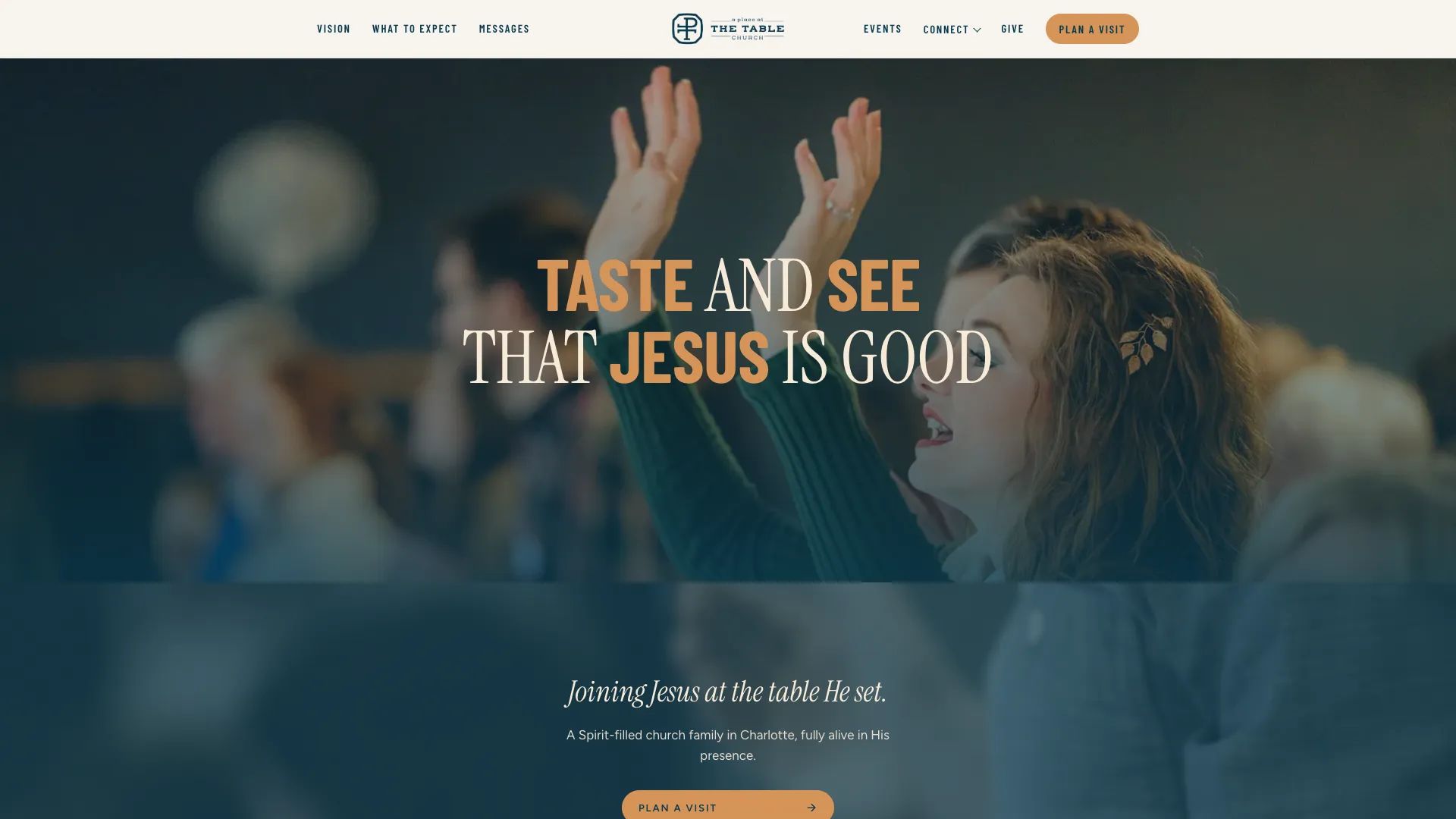
A Place at the Table is a church in Charlotte, North Carolina, led by David and Elizabeth Brown. The team already knew what they believed and how they wanted to live it. The hard part was saying it in a way a first-time guest could follow. Their website used older language, and it was split across three platforms. They came to us in April 2026 for a Brand Workday, our one-day brand session. That day led to a full website build: we started with the words, then designed the front door.
The Brand Workday
We ran a full Brand Workday with the church's leaders: eleven people in one room, from staff to lay leaders to the team behind The Resting Place, the church's care ministry. The day ran from ten to five with a working lunch, in seven blocks. We grounded the room, defined what wholehearted faith means for them, worked through mission, vision and values, mapped how the church and its ministries fit together, named who they are trying to reach, and sketched the website. The last block assigned owners and next steps, so the work didn't stop when the day did.
We built every tool for the day: a facilitator's guide, a client workbook, and a wall poster for the room.
The Language
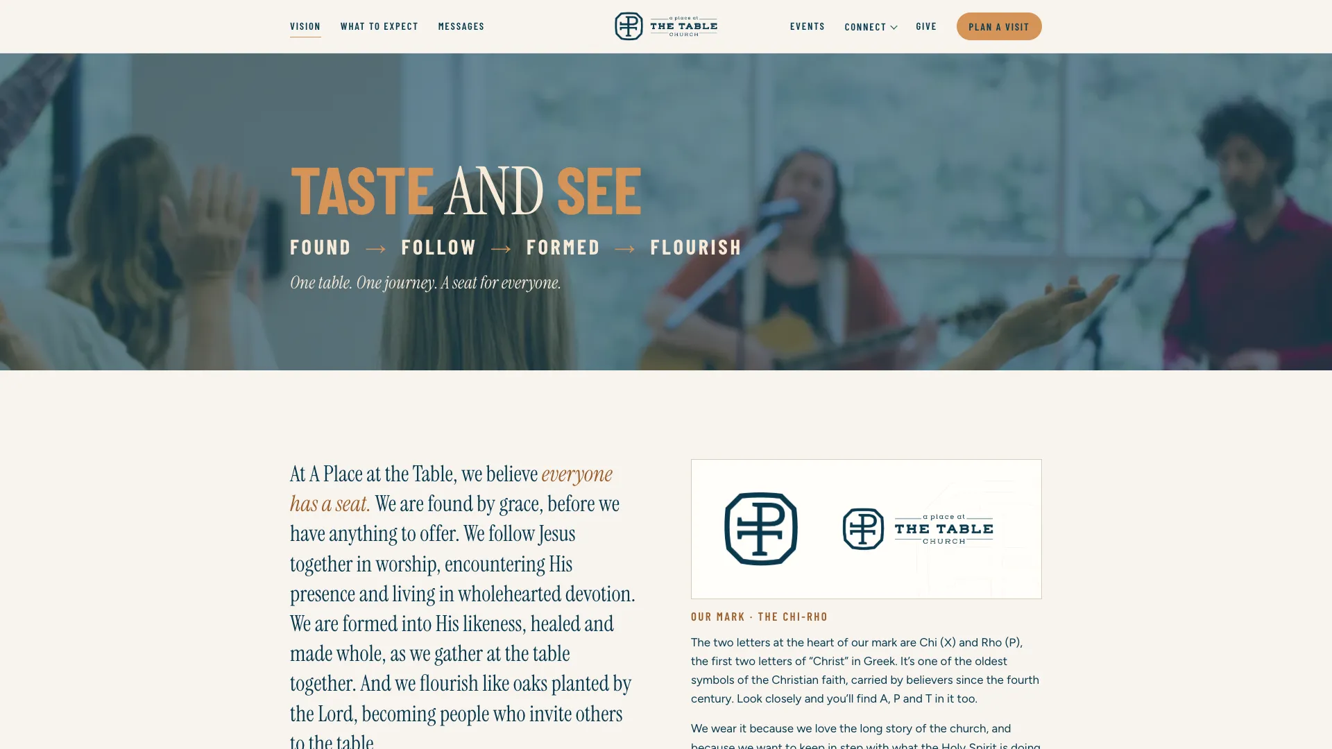
The day gave the church a simple rhythm for the whole journey of faith: Found, Follow, Formed, Flourish. It sits under a line they already loved: "Taste and see that Jesus is good." From there we wrote the website copy page by page, short and warm and clear to someone who has never walked in.
The Website
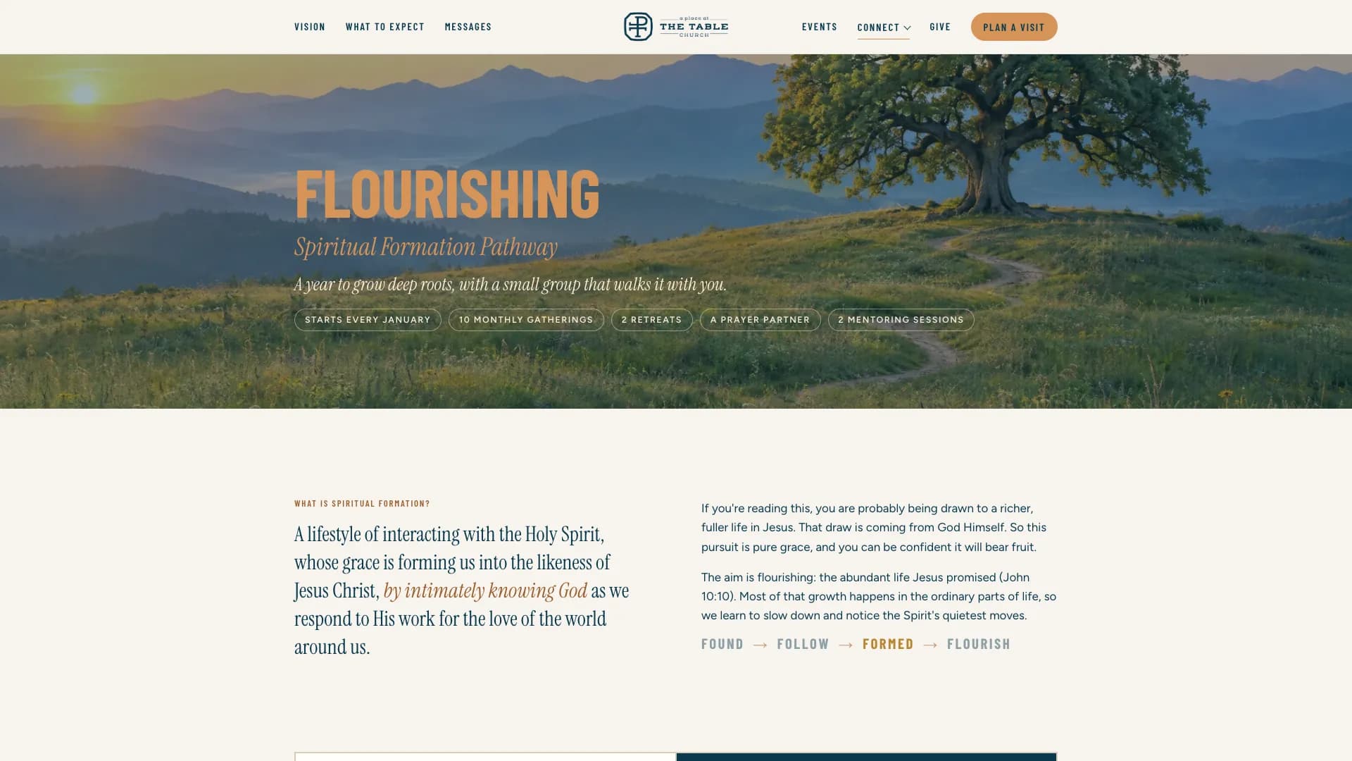
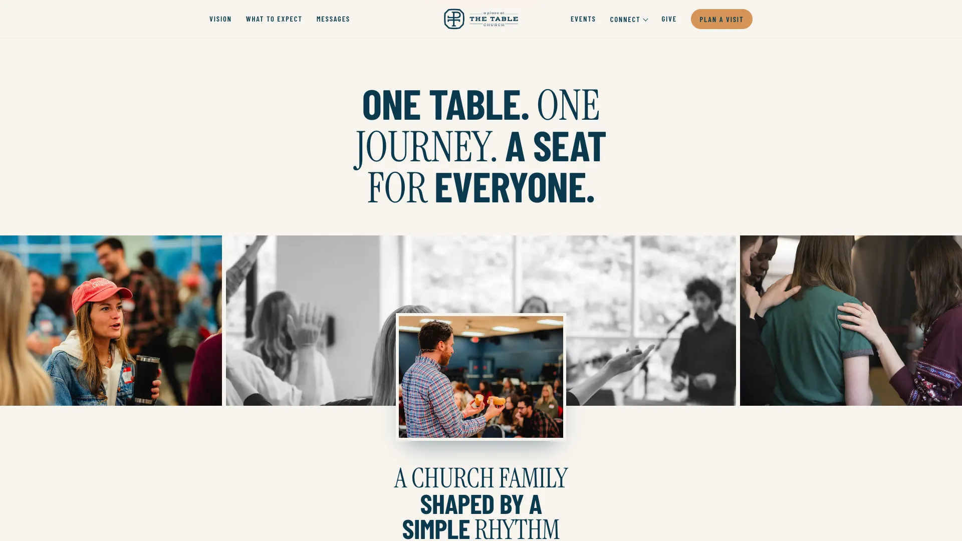
The new site is in progress. The screens here come from our approved mockup. It brings everything under one roof: Vision, Plan a Visit, Messages, Events, Give, Table Kids, The Resting Place, and a Connect menu for Table Groups, Equipping Classes and Flourishing.
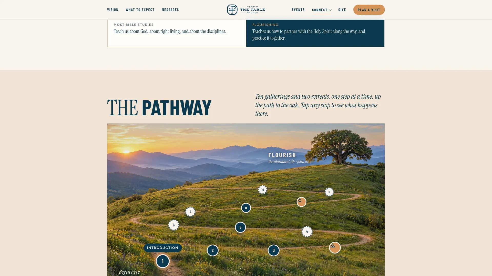
Flourishing, the church's year-long spiritual formation pathway, gets its own page with an interactive map. Visitors follow a trail of ten gatherings and two retreats up the hill to an oak, and can tap any stop to see what happens there. On a phone the same journey becomes a step-by-step trail. The type pairs a condensed sans with a serif for the words that matter most, set in the church's teal and copper.
Outcome
A Place at the Table now has shared language that the whole team can say the same way, from the pulpit to the welcome table. The website puts that language where a guest will see it first, and gives every ministry a clear place to live. What began as one Brand Workday became a full build, and the next step is launch.
Project Gallery
Ready to Build?
Start Your Project.
Your brand story is waiting to be told. Let's tell it right.